Report Designer User Guide
Introduction
RangerMSP reports can be customized in two ways:
- Edit the header - You can set or modify a header (text and image) for all reports at once. See more details in Editing Report Header.
- Design reports data and layout – You can customize the layout and data of any report to fit your needs using the Report Designer. You should first copy the report to you Custom reports, and then Click Design to open the Report Designer.
In this document, you will find information about how to use the Report Designer to customize your reports to fill the needs of your business. You will find here detailed information about the Report Designer toolbars, data groups, headers and footers, and the rest of the tools the Report Designer has to offer you.
Contents
Reports Preferences
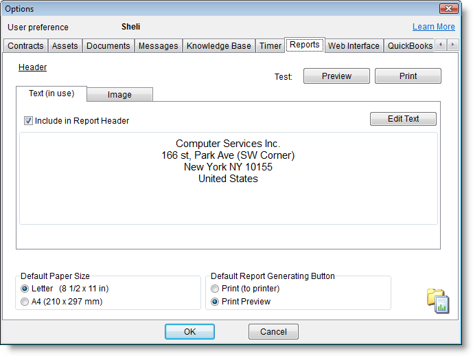
The Reports Preferences window allows you to adjust global options available in the system. Any of the settings configured in this window will only take effect once RangerMSP has been restarted on that computer.
| Option | Description |
|---|---|
| Report Header Editor | By editing the report header you can adjust the textual information and the logo displayed in your reports. See more details in Editing Report Header. |
| Default Page Size | Since most countries use either Letter or A4 size paper for their normal day-to-day paperwork, the system offers you the option to choose the default page size used in all reports created from that moment on. If you need to adjust the page size for existing reports, you’ll need to load that report in the report designer, open the page settings for that report from File > Page Settings, and pick the new page size for that report. |
| Print Button Options | This options allows you to choose the default button to be selected when open a report generation window. |
Editing Report Header
The Report header can be design with your textual header (with your company name, etc.) and your logo. The Report header is defined once for all reports and can be edited from the Tools menu. The Report header includes two parts: Text and Image (usually your Logo). The image file can be displayed with or instead of the textual header.
Reports Textual Header
The Textual Header contains your company details. The header gets its default content from the company information you’ve entered when the system was set up right after the installation. The text you set in this window will be automatically used in all RangerMSP reports that have the header section enabled.
To edit the textual header:
- Go to the Reports window and select Reports > Tools > Options…
- In the window that opens, stay on the Textual Header tab.
- Edit the Header text to your preference.
- Note: When used, the Image option (see section below) is displayed on top of the Textual header. To avoid overlapping, it is advisable to add some blank rows above the text, to make space for the Image file (logo).
- Use the Preview and Print options to test your design with real reports.
- Click OK to save your Changes.
To Remove Textual Header from Reports:
- Go to the Reports window and select Reports > Tools > Options….
- Stay on the Textual Header tab.
- Un-Select the option Include Textual Design in Header. This will only remove the Textual Designed part from the header, leaving the Image the same.
- Use the Preview and Print options to test your design with real reports.
- Click OK to save your changes.
Note: Removing the Textual Header as explained above affects ALL reports that show the Header section. The whole Header (Text and Image) can be removed for specific Reports by removing the Header section via the Report Designer. To remove the header, open the Reports windows and select a report you would like to customize. From the Reports menu, select Copy and choose a name for your new report. Check that the copied report is selected, and select Edit from the Reports menu. The report designer opens. Move all the fields located above the Header title/band to below the Header title. Right-click the Header title and unmark the Visible option.
Reports Image Header
Starting with RangerMSP 6.0, the Image Header can contain an image, usually used for displaying your company logo. The image you choose in this window will be automatically displayed in all RangerMSP reports that have the header section enabled.
To add an Image File to the Header:
- Go to the Reports window and select Reports > Tools > Options…
- Click the Image tab.
- Load the image you want to display in ALL reports:
- Only bmp, jpg, jpeg or gif files are valid for this purpose.
- Recommended size for the Image is: 740x80 pixels. Image is resized if it’s larger or smaller than recommended.
- Click the options at the bottom of the report to choose the desired location for the image in the report header. Possible options are: Left, Center or Right.
- Note: When used, the Image File is displayed on top of the Textual header. To display both Textual and Image file headers, it is advisable to add some blank rows above the textual header, to make space for the Image file (logo). See Reports Textual Header.
- Use the Preview and Print options to test your design with real reports.
- Click OK to save your changes.
To remove Image from Reports:
- Go to the Reports window and select Reports > Tools > Options…
- Click the Image File tab.
- Un-Select the option Include in Report Header. This will only remove the image file from the header, leaving the textual header the same.
- Use the Preview and Print options to test your design with real reports.
- Click OK to save your changes.
Note: Removing the Image from the Header as explained above affects ALL reports that show the Header section. The whole Header (Text and Image) can be removed for specific Reports by removing the Header section via the Report Designer. To remove the header, open the Reports windows and select a report you would like to customize. From the Reports menu, select Copy and choose a name for your new report. Check that the copied report is selected, and select Edit from the Reports menu. The report designer opens. Move all the fields located above the Header title/band to below the Header title. Right-click the Header title and unmark the Visible option.
Loading The Report Designer
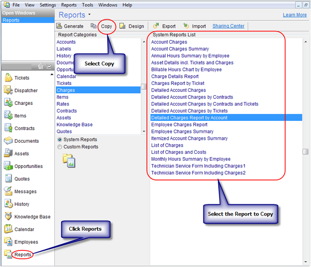
The report Designer can be accessed by copying an existing report that is similar to the report you want to generate and then designing it. It is very important to identify an existing report which can serve as the basis for the customized report you wish to generate. You must take into consideration when choosing the report both its layout and its data structure. Every report has predefined data source relations and fields that can be selected. To customize RangerMSP reports, open the Reports window, select the report you want to customize, select Copy from the toolbar and enter your new report name. The copied report will be selected. Select the Design button from the toolbar, and the report designer will open.
- Open RangerMSP, and go to the Reports Screen.
- Select the base report that you will be editing to your own needs.
- The base report can be selected from System based or Custom based reports.
- Select the Copy Option from the toolbar.
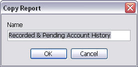
- Give your report a new name.
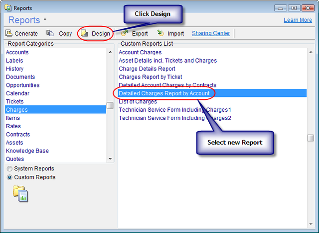
- Switch to Custom Reports.
- Choose your new report.
- Click Design from the toolbar.
The Designing Environment
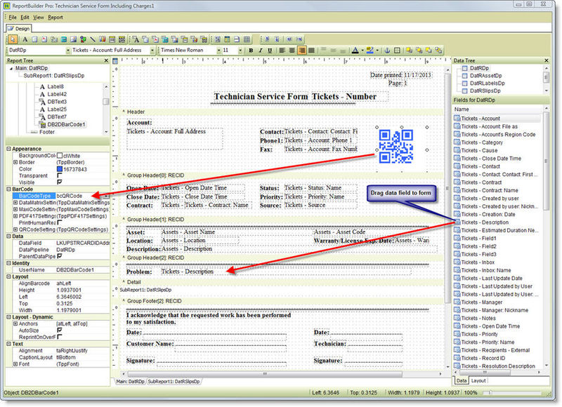
In this view, you are free to manipulate the position or size of any of the text labels or the data components. In the Default view shipped with the designer, you’ll notice there is a single tab (multiple tabs in some reports), the lower part of the screenshot above, your layout in the middle. Also, you’ll see several visible toolbars in a grouped configuration, there are also a number of hidden toolbars, with twelve toolbars available in total. These toolbars are as follows.
Visible Toolbars
Standard Components
The Standard components are basically text labels, images, shapes, charts or barcodes. These components are static by nature, meaning that their contents are predetermined during design usually for writing the text labels, inserting company logo or even a chart.
The items in the toolbar are as follows (By order of Left to Right).
| Component | Description |
|---|---|
| Select object (Arrow) | This is the tool used to select an item or multiple items by holding CTRL. |
| Label | This is the component used to set small basic text labels. i.e. Name: Address: Ph#: |
| Memo | This text component is used for displaying larger amounts of fixed text that the Label component offers. This component is useful for disclaimers, Terms Of Services, etc. |
| Rich Text | The Rich Text component allows you to activate the Rich Text Editor by right clicking the RTF field and choosing Edit. This allows you to use line breaks, and different formatting features. |
| System Variable' | The System Variable component allows you to place system data on the Report such as date, time, page number, page count and others. |
| Calc | This tool allows you to add time/date stamps, page indicator stamps, date printed stamp, etc. by placing a component and selecting a function from the edit bar. |
| Image | This tool allows you to insert a predetermined picture to the report. |
| Shape | This tool allows you to insert simple shapes to the report, by clicking the icon, selecting a shape from the edit bar, and placing the component in the report. |
| Line | This tool allows you to place continuous or broken lines to the reports. |
| Chart | This tool allows you to insert a static chart that will also be shown in an identical fashion on each report. |
| Barcode | This tool allows you to mark each report with the same barcode image. If you would like the barcode to be chosen, please use DBBarcode. |
| 2DBarcode | This tool allows you to mark each report with the same 2D barcode image (a QR Code for example). If you would like the barcode to be chosen, please use DB2DBarcode. |
Data Components
The data components are the items used to insert data from the RangerMSP Database into your report. These fields cross reference and list the data in the reports that you will later use to present to your customers, and use in the office to organize the workflow not just for you, but your whole business. These reports include technician service summary quotations, charge lists, account history printouts, Charts, lists, and much more.
The items in the toolbar are as follows(By order of Left to Right):
| Component | Description |
|---|---|
| DBText | This tool allows you to insert short text fields from the database. The selected field in the edit bar such as Accounts – Name, is later cross referenced with the stipulations in the report generation window. Note that for each type of report, different combinations of fields are available, we’ll get into that later in this manual. |
| DBMemo | This tool allows you to insert larger text memos from the database in the same manner as the previous tool. It is resizable in the report generator, and is ideal for Ticket Description, Account Notes, Charge Description, etc. |
| DBRichText | This tool allows you to insert large amounts of text from the database and inserted with rich formatting capabilities. There’s an editor if you right click the component in your layout and choose Edit. |
| DBCalc | This tool allows you to place simple mathematical formula such as SUM, AVERAGE, MIN, and MAX into your reports. Just right click the field select Calculations... to set your formula. Then select the database field to be associated with this formula from the edit bar. |
| DBImage | This tool allows you to insert images referenced in the database into the report. |
| DBBarCode | This tool allows you to insert database referenced barcodes into your report for stuff like asset code, serial numbers, etc.. This is useful if you use barcodes to identify assets, accounts, and items. The report will display the barcodes in a standard barcode format, unless the user selects a different barcode format to be used. |
| DBChart | This tool allows you to insert a chart into your report that calculates all the entries in report and displays the results in an easily readable report. Customers love these things… This is an advanced option and may be difficult to fine tune. We suggest using them as they are in reports that already have them, or to export your data to Excel and use Excel’s charting tools, for more powerful features. Alternatively, if you're an advanced user, you can configure the RangerMSP ODBC Connector to serve as an information conduit from the RangerMSP database right into your Excel Charts. |
| DB2DBarCode | This tool allows you to insert database referenced 2D barcodes, such as QR Codes, into your report for info like asset code, serial numbers, address etc.. This is useful if you use barcodes to identify assets, accounts, and items. The report will display the barcodes in a standard 2D barcode format, unless the user selects a different barcode format to be used. |
Advanced Components
Use of the advanced components is used for separation and sub-reporting. There’s only 2 of them, but you’ll use them plenty. The items in the toolbar are as follows (By order of Left to Right):
| Component | Description |
|---|---|
| Region | This tool allows you to mark a section reserved for small DB fields like Name, Address1, Address2, etc. so that different sections in the smaller, more delicate parts of the report are preserved. |
| Sub-Report (Advanced) | This tool allows you to generate separate layout window for parts within the report. For example, in a charge report for tickets, the charges list can be arranged as a sub report for easier layout settings. This operation creates a tab on the lower edge on the left side named by the value in the component’s edit field. Once the component is positioned, you can switch to the next tab, and start creating your Sub Report. |
| Page Break | This tool allows you to place a page break at any place you want on the Report page. |
| TableGrid | This tool allows you to place a grid on the Report.. |
| Note: Each Sub Report uses their own data sources and should be used carefully, it's generally recommended to use already-existing sub reports when available. Creating new sub reports should be consulted with the RangerMSP support team to assure best results. |
Edit
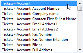
The edit bar is used to select the value of the component you’ve just selected in your layout. If you’ve selected a text component or a memo component, you’ll see the inputted text in the edit bar. If you’ve selected a DB component, you’ll see the category – fieldname, and you’ll be able to choose any different field available by dropping this field to a menu.
Format
This toolbar looks familiar enough, they can be used to reformat your text and control the object depth. The items in the toolbar are as follows (By order of Left to Right):
| Component | Description |
|---|---|
| Font Selector | This tool allows you to change the selected font for text display. E.g. Times New Roman, Arial, Tahoma, etc. |
| Font Size Selector | This tool allows you to change the size of the text selected. |
| Bold | This tool allows you to make bold text. |
| Italics | This tool allows you to make italic text. |
| Underline | This tool allows you to make underlined text. |
| 4 Text Positioning Modes | These tools allows you to switch the text alignment with in each component placed on the layout. (Left, Center, Right, Justify). |
| 3 Vertical Text Positioning Modes | These tools allows you to switch the vertical text alignment with in each component placed on the layout. (Top, Middle, Bottom). |
| Font Color | This tool allows you to use colored letters in your reports. |
| Highlight Color | This tool allows you to use colored text backgrounds. |
| 'Anchors | This tool allows you to .. |
| Borders | This tool allows you to add a border around a selected component on the Report. |
| Bring Forward | This tool allows you to bring an object up a level, so it is visible over the one below it. |
| Bring to Front | This tool allows you to bring an object to the top level, so it is visible over the others below it. |
| Send Backward | This tool allows you to move an object back one level so that the other object above can cover it. |
| Send to Back | This tool allows you to place an object in the background so that other objects can cover it. |
Hidden ToolBars
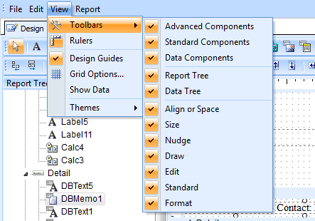
The hidden toolbars must be opened to be used. There are 2 ways to open them. The first way is from View menu > Toolbars, and the second method is to right-click an existing toolbar and select from the context menu that shows up. The menus hidden by default are as follows:
Standard
This toolbar is used for file, printer and clipboard tasks. The items in the toolbar are as follows (By order of Left to Right):
| Component | Description |
|---|---|
| Open | This tool allows you to open files saved in the Report Designer in to the current document. |
| Save | This tool allows you to save the current layout as a file loadable by Report Builder in to other reports. |
| Page Setup | This tool allows you to select the different options about page size and orientation. |
| This tool allows you to print the layout/preview as displayed in the builder. If you want one with database entries, try generating the report. | |
| Print Preview | This tool allows you to see what you’re going print before you waste ink or a page. |
| Cut | This tool allows you to cut the selected entities to the clipboard. This removes the original. |
| Copy | This tool allows you to copy to the clipboard, without removing the original. |
| Paste | This tool allows you to paste the contents of the clipboard into your report. |
Draw
The Draw toolbar allows you to draw simple shapes inside the report. The items in the toolbar are as follows (By order of Left to Right):
| Component | Description |
|---|---|
| Fill Color | This tool allows you to fill any shape created with these tools to any color you choose. |
| Line Color | This tool allows you to change the color for the selected line, or lines pending creation. |
| Gradient | This tool allows you to add a gradient with selectable colors to a Shape component. |
| Line Thickness | This tool allows you to adjust the thickness of the selected line or any lines pending creation. |
| Line Style | This tool allows you to generate broken lines, continuous lines, and other similar styles. |
Align or Space
These tasks are used to reposition the selected component/s with a stipulation. This makes organizing the report much easier to keep orderly. The items in the toolbar are as follows (By order of Left to Right):
| Component | Description |
|---|---|
| Align Left | This tool allows you to shift the selected component to the left side of the document. |
| Align Center | This tool allows you to shift the selected component to the center of the row it’s on. |
| Align Right | This tool allows you to shift the selected component to the right side of the document. |
| Align Top | This tool allows you to shift the selected component to the top of the page. |
| Align Middle | This tool allows you to shift the selected component to the middle of the document page. |
| Align Bottom | This tool allows you to shift the selected component to the bottom of the page. |
| Space Horizontally | This tool allows you to select multiple components and have them evenly spaced horizontally. |
| Space Vertically | This tool allows you to select multiple components, and have them evenly spaced vertically. |
| Center Horizontally In Band | This tool allows you to group multiple components into 1 separated horizontal field. |
| Center Vertically In Band | This tool allows you to group multiple components into 1 separated vertical field. |
Size
These tasks are to resize the selected component/s by height and width. The items in the toolbar are as follows (By order of Left to Right):
| Component | Description |
|---|---|
| Shrink Width to Smallest | This tool allows you to make a selected component narrower. |
| Grow Width to Largest | This tool allows you to make a selected component wider. |
| Shrink Height to Smallest | This tool allows you to make a selected component shorter. |
| Grow Height to Largest | This tool allows you to make a selected component taller. |
Nudge
Nudging is the term used in the Designer for moving a component in a metered distance in different directions. The items in the toolbar are as follows (By order of Left to Right):
| Component | Description |
|---|---|
| Nudge Up | This tool allows you to make a selected component move up. |
| Nudge Down | This tool allows you to make a selected component move down. |
| Nudge Left | This tool allows you to make a selected component move left. |
| Nudge Right | This tool allows you to make a selected component move right. |
Report Menu
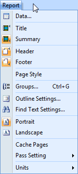
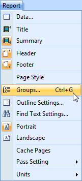
The Report Designer'sReports Menu is a layout control menu which can toggle parts of your layout to be shown or hidden. Report Sections are parts of the report that are separate from other parts. some sections such as Header, Footer, and Summary have their own static purposes, while other miscellaneous groups such as Group1, Group2, Etc. can be used to display any static or database information you like.
Data Source
The Data menu option provides access to the Data Source available for this report. Different report types come with different available fields. Database field is a field of information stored in the RangerMSP database. These represent information in the database, which you’d like to have displayed in your reports. The available database fields list varies according to the report type.
Each report has a pre-defined list of available fields according to the report pre-defined design. In most cases, the main category fields are available (e.g. Ticket fields for a Ticket report, Charge fields for a Charge report, Account fields for all reports, etc.), and you may have some select fields from other categories as well (e.g. some based Account fields in a ticket report).
Changing the Data Source can change the report behavior, and these settings should only be changed after consulting with the RangerMSP support staff.
Groups
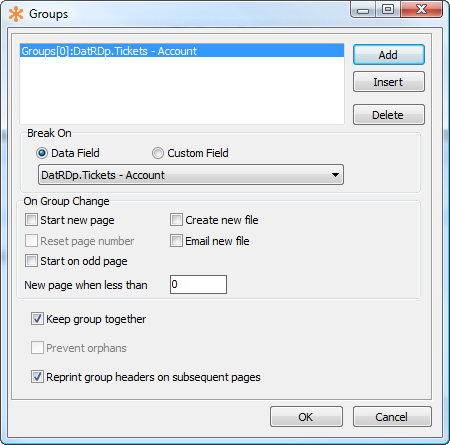
Groups are containers used to divide the sections of a report. Some sections can be static, their components never grow. Some groups can have lists taken from the database, and run with it for many pages. These groups are inserted from the groups window, located in the reports menu. (Please see screenshots).
In this window, you can see a list of existing groups (if any), and you can select the field to group them by from the dropdown menu above the list. Once you’ve selected your group, you can insert 1 or more of those groups. These groups get placed in your report, and can be set to dynamic or static height, by right clicking a group separator. Each group will divide the report in to separate sections (Header, Footer, Summary, Detail, etc.). some sections show up on every page, and some groups only show up on the first or last pages, so you should take this into consideration when inserting components, so you know where the best place to place it is, so that it shows up as many times as you need.
Report Layout
This section describes the different sections that make up the Report Layout. Each section of the report can be resized to be able to include more information, and can also be set to dynamically resize itself by selecting the DynamicHeight option when right clicking a section bar.
The Header
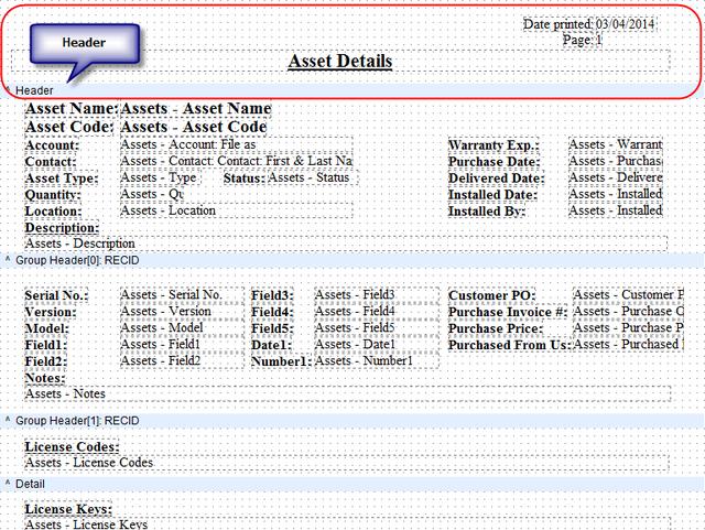
The Header is used to place report introduction information at the head of the report. This section get’s shown at the beginning of each page of the document. The header is ideal for showing the static information like report title, page number, print date, your company information and logo, etc.
For list reports it's also used to display the columns headers which should be displayed at the beginning of each page
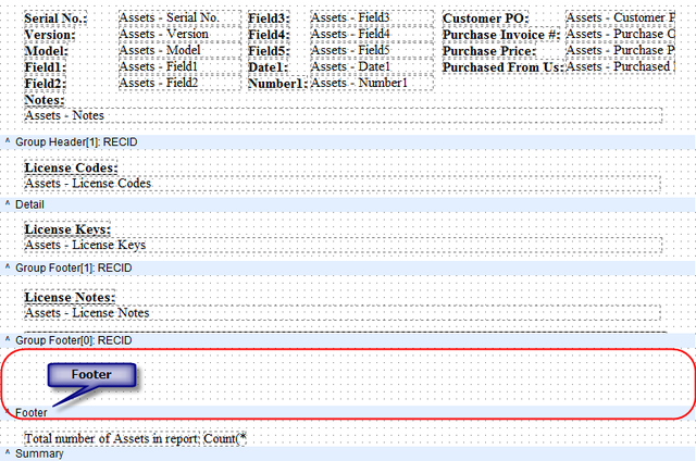
The Footer section is the last section of each page of the report to be printed. Like the header it gets printed once at the bottom of each page of the report. The footer/bottom group is ideal for displaying report comments, signature field, payment terms, warranty, etc.
Detail
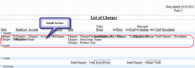
The Detail section is the area where the list data will be displayed. This should have the fields to be displayed in each column. When generating the report, the system will see how many records come up with the stipulations inputted in the report generation window, and print all the records in the detail section. (More on the report generation window later)
Summary
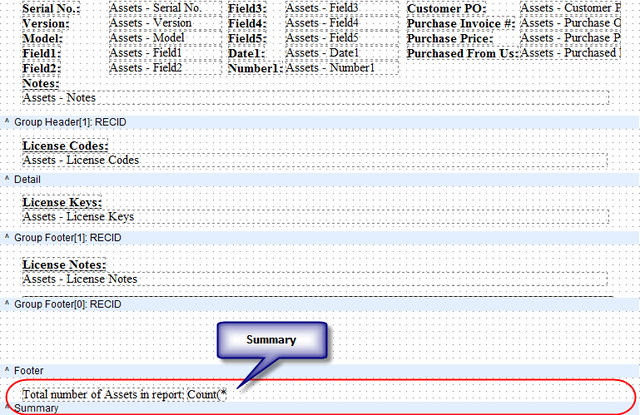
This section in the report is located under the details section where your list will be displayed.
Sub-Reports
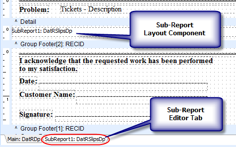

The sub-reports tool allows you to generate a separated report within your main report, which is ideal for designing a separate part within the report. E.g. if you’re creating a ticket report, and you’d like to have that ticket’s charge report inside, then you’d generate a sub-report for the charge section. The sub-reports function is an advanced function, we recommend to make use of it only in reports which already have these sections within them. Adding your own sub reports can be tricky and should be consulted with the RangerMSP Support team first.
Report Tree
The Report Tree sits on the left column in the Designer and is where you can configure numerous options relating to the components you place on your Report. For example to configure a QR Code you would first select the 2DBarCode or DB2DBarCode component, place it somewhere on the Report Designer screen and then in the Report Tree you will see a BarCode section where you can select the BarCodeType.
Data Tree
The Data Tree sits on the right side of the Designer and lists all the components available to use in a Report. Adding components can be done very easily just by selecting one from the Data Tree and dragging it to the main Report Layout screen.
Default Printer
Another new feature in the Report Designer is the ability to specify the default printer to use for Custom Reports so you can send different types of Report to specific printers. For example a labels Report could be sent to the labels printer, formal reports that need to look good for your customers or partners can be sent to the high quality color laser printer, while internal reports could go to the basic black & white printer. Since this is a default setting defined for the specific Report, you do not have to select the right printer to send it to each time you want to generate that Report. To access this setting simply go to File > Page Setup in the Report Designer and select the Printer Name.
Technician Service Forms with Charges
These reports come predefined with the ability to display information from 3 different data sources (Tickets, Charges and Assets) and consolidate all of them in a single report. By copying the Technician Service Form with Charges, you’ll be able to use it as a template to create any report you like that has access to the main data sources in RangerMSP. However, when referring to Charge information, the report must always be saved in the Charges section of the Reports screen, or the information will come up empty.
Copying Report Sections From Report to Report
Using Windows Clipboard you can select components from the report layout and copy them from 1 report to another report. By dragging a selection box around multiple layout components you will have the ability to select all the components in your selection box. Once this is done, you can use the CTRL-X/C/V shortcuts to copy/paste the information to your new report, and re-arrange them as a group.
Note: In order for a component copied from a different report to work, you must have the ability to insert that specific component into the report itself. This can be verified by browsing through the data-field list shown in the Edit Bar when data components have been selected.
Printing Reports from the Ticket Window
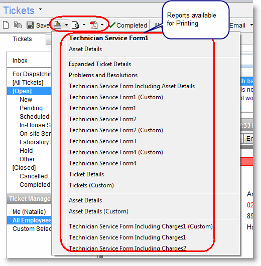
When viewing a Ticket in the Tickets window, you can print a Ticket report directly from the Print/Print Preview options in the Tickets window toolbar. Only detailed Ticket reports (as opposed to lists Ticket reports) are listed here.
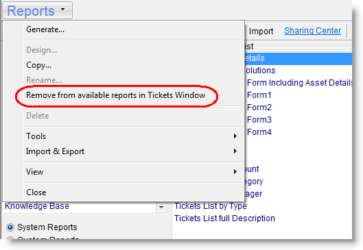
The list of reports which appears in these options can be modified to show only reports you actually need to be accessible from this window.
To configure each report, and control whether it is accessible from the Ticket window:
- Go to the Reports window
- Choose the relevant report.
- Select Report > Make report available from Tickets window or Report > Remove from available reports in Tickets Window option.
Frequently Asked Questions
The Report Designers FAQ page also includes lots of useful tips and workflows that would greatly ease the transition into customizing of your RangerMSP reports. For more information see Reports FAQ.
